
5 Website Mistakes That Quietly Kill Wedding Photographer Bookings (And How to Fix Each One Fast)
5 Website Mistakes That Quietly Kill Wedding Photographer Bookings (And How to Fix Each One Fast)
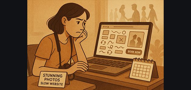
Introduction: When Great Work Isn’t Enough
Your photos are stunning. Your clients love you. But your website? It isn’t booking like it should.
The truth is, most photographers lose clients not because of skill—but because their website quietly pushes couples away.
In this article, we’ll break down five hidden mistakes that kill your conversion rate (and how to fix each one fast).
No new ads. No extra posting. Just smart, strategic changes that make your website book clients again.
The Origin Story: The Playbook That Fixes Friction
When I started building websites for wedding photographers, I noticed a pattern.
Photographers with incredible portfolios weren’t struggling with talent—they were struggling with friction.
Their websites were confusing, slow, or generic. Couples loved the photos but hated the experience.
So I tested, rebuilt, and optimized dozens of sites—until I created a playbook that turns websites into client-generating machines:
- ✅ Fast
- ✅ Clear
- ✅ SEO-optimized
And that’s what this article is based on.
The Real Problem: Couples Compare Experiences, Not Portfolios
Here’s the truth: couples aren’t comparing your photos—they’re comparing experiences.
Think of it like this: you walk into a restaurant that looks amazing from the outside. But when you open the menu, it’s a mess—10 pages, no order, no clarity. You just walk next door.
That’s your website when it’s slow, cluttered, or unclear. Couples don’t want to decode your site—they just want to know, in seconds, that you’re the right fit. When they don’t? They move on.
Mistake #1 — Slow Load Times (and How to Fix It)
Nothing kills bookings faster than waiting five seconds for a homepage to load. Your website should load under two seconds—ideally under one.
Every extra second of delay can reduce conversions by up to 7% (Cloudflare).
🔧 Quick Fix:
- Compress your images before uploading.
- Use optimized hosting.
- Minimize animations and plug-ins.
- Avoid bloated page builders—lean toward clean HTML/CSS builds.
A recent site I optimized dropped from 250MB to 1.8MB and scored 100/100 on Google PageSpeed. The result? Immediate increase in time-on-site and inquiries.
Mistake #2 — Confusing Messaging (Who, Where, What)
If I can’t tell who you are, where you’re based, and what kind of weddings you shoot within 3 seconds, you’ve already lost me.
A confusing homepage feels like walking into a wedding with no signs, no directions, and no greeters.
💡 Fix It:
Your homepage should immediately say:
“Hi, I’m [Your Name], a wedding photographer based in [Location], specializing in [Your Style].”
That one sentence instantly builds trust and clarity.
Mistake #3 — No Proof = No Trust
Couples won’t book without proof. They need to see that others trusted you first.
✅ Fix It Fast:
- Show testimonials and real client feedback.
- Include press features or publication badges.
- Add full galleries (not just highlights).
- Don’t bury reviews on a separate page—show them right below the fold on your homepage.
It’s like saying you’re the best tennis player in the world, but never showing a trophy. People won’t believe it until they see it.
Mistake #4 — No Clear Call to Action
Most photographer websites end with... nothing. No next step. No direction. Just silence.
That’s like walking into a store ready to buy—but there’s no checkout counter.
🚀 Fix It:
Every page should have one clear CTA (Call to Action):
- “Check availability”
- “Book your date”
- “Let’s talk”
Remove all the guesswork. People should never wonder what to do next.
Mistake #5 — Poor Mobile Experience
Over 70% of couples browse your website on their phone.
If your site has tiny text, broken layouts, or laggy scrolls, it feels like using a camera with sticky buttons—frustrating and unprofessional.
📱 Fix It:
- Test your website on an actual phone (not just a preview).
- Fix any overlapping text or broken buttons.
- Keep scrolls smooth and touch areas large.
Mobile is not an add-on—it’s your main storefront.
Bonus Tip — Generic Design vs. Branded Design
Templates make you look like everyone else. It’s like showing up to a party wearing the same outfit as five other people—you blend in.
🎨 Fix It:
You don’t need fancy. You need fast, clear, and branded. Your website should look and feel like you—not a copy of someone else’s Wix template. That’s what makes you memorable.
Dark Mode — The Premium Feel Modern Couples Expect
Every site I build now includes dark mode. Why? Because couples expect a premium, polished, luxury experience.
Think Apple, Airbnb, or Vogue—every major brand offers it. Same design, but the feel is elevated.
Dark mode doesn’t just look sleek—it positions you as a professional with taste and attention to detail.
The Shift: Traffic → Trust → Bookings
Once you fix these five mistakes, everything changes. You stop chasing viral posts and start converting traffic into trust—and trust into bookings.
Case Study Proof: How Speed + Clarity Convert
We applied this exact framework for a photographer named Arad. Same photos. No new content.
- ✅ Faster load time
- ✅ Clear messaging
- ✅ One strong CTA per section
And the results?
- More time on site
- Higher engagement
- More inquiries—instantly
“It feels warm, elegant, and professional. Everything flows smoothly—scrolling through it feels like a pleasure.”
Future Vision: Your Website as Your Best Closer
Imagine a couple landing on your website and instantly knowing: “This is the one.”
Your homepage loads instantly. It’s elegant, premium, and effortless to navigate. It answers their questions before they ask them.
That’s when your website becomes your best closer—working 24/7, even while you sleep.
CTA — Ready to Build a Website That Actually Books?
If you want a site that doesn’t just show your work—but actually books your dream clients, that’s what I build.
- ✅ Fast.
- ✅ Crystal clear.
- ✅ Google-optimized.
Built exclusively for wedding photographers.
I personally take on only two photographers each month, so each site gets my full attention.
If you’re charging $2K+ per wedding and want one of those spots, hit the link in the description and apply—it only takes a minute.
FAQs
- Why is my website not booking clients?
Because clarity, speed, or trust are missing—usually all three. - What’s the ideal website load time?
Under 2 seconds. Google prioritizes fast sites. - Should I use a website template?
Only if you customize it deeply. Templates alone make you look generic. - Where should I place testimonials?
On your homepage, ideally right under the hero section. - Do couples really care about dark mode?
Yes—it subconsciously signals “modern” and “premium.” - How do I test my mobile design?
Use your phone, not a preview. Scroll, tap, and try to inquire. If it’s not seamless, fix it.
Conclusion
You don’t need more ads, more posts, or more luck. You need less friction and more clarity.
When your website loads fast, looks branded, and tells your story clearly—couples don’t just notice you. They trust you. They book you.
And that’s when your website stops being a portfolio—and becomes a booking machine.
See It in Practice
This video breaks down the five hidden website mistakes that quietly kill bookings—and how to fix them fast. 🎥
Final Thoughts: Speed, Clarity, Trust
Keep it fast. Keep it clear. Make trust obvious. Do that—and you’ll turn your website into your best closer.