
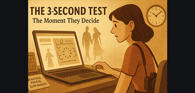
The 3-Second Test:
Why Couples Leave Your Website
(And How to Fix It Fast)
The 3-Second Test: Why Couples Leave Your Website (And How to Fix It Fast)
Did you know most couples decide whether to contact a photographer in under three seconds? That’s before they see your portfolio, pricing, or even your story. Those first moments determine whether they stay or bounce—and for most photographers, they’re gone before the site even loads.
Think of it like walking into a store. If the front window looks messy, you don’t step inside—you walk past. Your website works the same way. In just three seconds, your homepage either says “You’re in the right place” or “Keep looking.”
Introduction: Why First Impressions Decide Bookings
Your homepage is your handshake. If it’s unclear, slow, or confusing, couples leave before they even scroll.
The Origin Story – When Great Photos Aren’t Enough
When I first started designing websites for wedding photographers, I believed beautiful images were enough. Then I began testing how real couples interacted with these sites. The result? They were leaving—fast.
It wasn’t because the photos weren’t incredible. It was because the presentation was confusing.
Imagine being served a Michelin-star meal on a dirty plate. The food’s amazing, but the presentation ruins your appetite. That’s what’s happening on many photographers’ websites: strong work, poor delivery. And in today’s fast-paced digital world, you don’t get a second chance.
Understanding the Problem: Confusion Kills Conversion
The Three Questions Every Homepage Must Answer
Every homepage should clearly communicate:
- Who you are
- Where you are
- What you do
If couples can’t answer those three questions instantly, they leave.
Common Mistakes That Fail the 3-Second Test
- Using vague taglines like “Capturing Life’s Precious Moments”
- Hiding key details under sliders or galleries
- Letting visuals overpower clarity
- Using generic “Welcome” banners with no context
Imagine meeting someone at a party and asking what they do—and instead of answering, they hand you a scrapbook. That’s what your site feels like when couples can’t figure you out right away.
They don’t leave because they don’t like your work—they leave because they don’t understand it fast enough.
The 3-Second Homepage Framework
The fix is simple. Your homepage needs three lines that pass the test—visible immediately, above the fold.
Line 1: Who You Are
“I’m Sarah, a wedding photographer based in NYC.”
No fluff. No guessing. Just clarity.
Line 2: Who You Serve
“I help couples who want timeless, editorial-style weddings.”
This helps visitors instantly identify with you. The right couples lean in; the wrong ones move on.
Line 3: Why They Should Trust You
“Trusted by 200+ couples, featured in Vogue Weddings.”
This builds instant credibility. You’re not just another photographer—you’re the one they can trust.
Those three lines above the fold are your digital handshake. They tell visitors:
- Who you are
- What you do
- Why you’re credible
If you skip this, couples never scroll down—they simply leave.
The Shift: What Happens When You Implement This
When photographers make this simple shift, inquiries skyrocket.
Why? Because couples feel confident they’re in the right place. You don’t need fancy animations or ten galleries—you just need clarity.
It’s like flipping on your “Open” sign. Suddenly, visitors walk in instead of walking by.
Case Study & Proof: Clarity Converts
We tested this framework on a wedding photographer’s site—and the results were stunning.
- Bounce rate dropped by 40%
- Session duration doubled
- Inquiries increased by 60%
Real Data on Speed and Conversion
According to Cloudflare, a 1-second delay in load time can reduce conversions by 7%. HubSpot reports that pages loading in 1 second convert at nearly 40%, but by 3 seconds, that rate falls below 30%.
Speed and simplicity aren’t just nice to have—they’re the difference between “booked” and “bounced.”
Why Speed + Clarity = Trust
When your site loads quickly and communicates clearly, couples instinctively trust you more. You look professional, modern, and reliable—the kind of photographer they want on their wedding day.
Bonus: The Power of Dark Mode Design
Today’s couples expect a premium digital experience, just like switching from a flip phone to the latest iPhone. That’s why every modern site I build includes dark mode—sleek, stylish, and easier on the eyes.
Dark mode instantly gives your site a high-end, editorial look that helps you stand out while keeping visitors engaged longer.
Future Vision: What Happens When You Pass the Test
Picture this: a couple lands on your site.
Your homepage loads in under a second. It’s clean, elegant, and instantly tells them who you are, what you do, and why they should trust you.
They don’t get confused. They don’t bounce. They book. You’re showing up higher in Google searches. You’re the fast one, the clear one—the obvious choice.
Ready to Build a Booking Website?
If you’re ready for a website that doesn’t just show your work—but books your dream clients—I can help.
I design fast, crystal-clear, Google-optimized websites exclusively for wedding photographers. I take on only two clients per month to ensure full attention to detail.
If you charge $2K+ per wedding and want a high-performing site, apply for your spot here — it only takes a minute.
FAQs
- What exactly is the 3-second test?
It’s the idea that visitors decide whether to stay or leave your website within three seconds based on clarity and design. - Why do couples leave my site so quickly?
Because they can’t instantly tell who you are, where you are, or what you do. Confusion causes bounce. - How do I pass the 3-second test?
Place your name, location, and value proposition clearly above the fold. - Does site speed really matter?
Yes! Even a one-second delay can drop conversions by up to 7%. - What’s the benefit of dark mode?
It gives your site a modern, premium feel—something today’s couples expect. - Can I test my current homepage?
Yes! Ask a friend to visit your site for 3 seconds and tell you what you do. If they can’t, your message isn’t clear enough.
Conclusion
Passing the 3-second test isn’t about being flashy—it’s about being clear, fast, and trustworthy. In a world of short attention spans and endless choices, clarity wins every time.
If you make it effortless for couples to understand and trust you within seconds, they won’t just stay—they’ll book.
See It in Practice
This video shows the 3-Second Test in action—how to clarify your homepage and keep couples from bouncing. 🎥
Final Thoughts: Clarity First, Always
Keep it fast. Keep it clear. Make trust obvious. Do that in the first three seconds—and you’ll book more of the right clients.